On Your Marks, Get Set - Logo!

2023 | 6 min reading time

How is a logo actually created? - A short project documentation

A logo is what stays in the minds of customers or users and is recognized everywhere - or at least it should be. New brands come onto the market or redesigns take place every day, so how can you stand out? A design that is well derived from the brand identity is the key. After all, nobody wants a random logo design that looks like something from a logo generator or something generic looking like it came out of an AI logo tool, but a logo that is individually tailored to you and reflects your brand.

The brand comes before the logo

Regardless of whether the logo is presented as a visual or word mark or a combination of both, it should always have a clear connection to the brand. There are many crucial questions at the beginning of the process.

What product or service is being offered? What values does the company represent? Is there a company history that we can build on? Which market does the company operate in? What is the external perception of others in the market? How is the current external perception perceived by others? How should the company be positioned in the future?

Questions upon questions. It doesn't matter whether you already have the answers or whether we navigate through this process together. From a brand workshop and market analysis to the finished logo or even the entire corporate identity - we sprint ahead for you or hold hands with you until the end.

Not just showing, but also doing

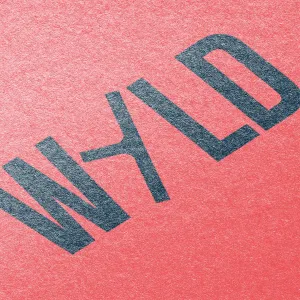
Using one of our projects from the last few months as an example, we'll show you what this can look like. For WYLD, a Berlin office for landscape architecture, we were able to conjure up a new logo.

Following the takeover of the office by Philip Winkelmeier, a generational change was heralded, which was also to be reflected in the corporate design. Our client opted for the name WYLD. The Winkelmeier team associates the name with courage, a spirit of adventure, authenticity, originality, passion, ambition and dynamism.

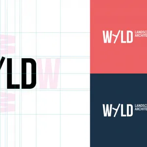
Our task was to develop an independent word mark that incorporates these components. We were enthusiastic about the idea of replacing I with Y. For us, the Y stands for how we understand WYLD: A company with history, with expertise and with the ambition to also question the status quo (Y=Why?).

A moodboard a day, keeps the nonsense away

The collections of inspirations from various theme-related images in combination with colors, structures and styles provide an initial exemplary overview of a possible direction.

For WYLD, due to the name change and the historical reference, our full focus was on the Y! To this end, we created mood boards with three different derived routes.

Initial approaches and logo designs

The mood board was followed by the first drafts with curated fonts for each route. For WYLD, a design for the wordmark followed for each of these routes.

On your marks, get set - logo!

With a final choice of route, a final typography decision and the choice of color, the finished logo is ready after the fine-tuning.

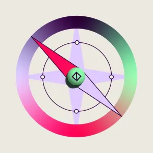
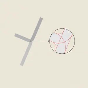
The selected route is called the WYLDweiser, derived from a crossroads. When you come to a crossroads, you inevitably have to make a decision: “Do I take the straight path or the WYLD one?” The resulting figurative mark is multi-layered and allows for various associations.

A logo that looks more than just good

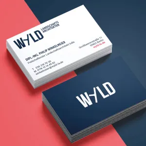
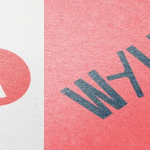
The logo should be just as functional as it is versatile. With a placement on the website, business cards and stationery, it is used digitally and in print form. For this purpose, the logo must function in a wide range of sizes, versions of reduction and color variants.

You can find more projects and cool designs in our portfolio.

Portfolio
Tags: Design, Logo, Marke, Prozess, Corporate Design, Corporate Identity

Marina Rost

UX Design | ZENTRALNORDEN

As a strategic designer with an IoT background, Marina is dedicated to all UX & UI topics at Zentralnorden, always with the right method as an ace up her sleeve. Marina is strategically involved in many areas and always has the metaphorical scalpel at hand. The more complex the topic, the better.