For more Diversity within the Museum Landscape

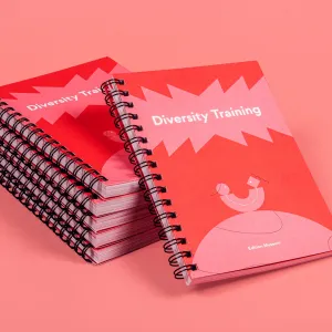
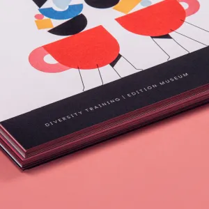
A stack of

Client

HTW x ZENTRALNORDEN

At ZENTRALNORDEN, we have a clear vision: We are "Ready for tomorrow!". As a design and consulting agency, we prefer to implement projects together with partners that bring us closer to this kind of vision. In cooperation with HTW Berlin, we created the special project "Diversity Training" with the aim of making the museum landscape more diverse. Every week, Museum Management and Communication students give impulses on the wide topic of diversity, which are staged by our graphic design.


Services
Concept
Illustration
Editorial Design

Diversity

Diversity means consciously dealing with variety in society, no matter what age, ethnic origin, gender, sexual orientation, abilities, religion, ideology or social background. The aim is to create an equal environment. Diversity-oriented action gives space to different voices, values perspectives and experiences as well as promotes solidarity.

Museum Landscape

Diversity is becoming increasingly important in museum work in order to enable social participation. Museums should create a space for everybody, but mostly white, highly educated people are working there. This prevents other perspectives and stories from being included. Diversity strategies are needed to overcome these barriers and recognize privileges.

Challenge

Diversity is a concept that requires the conscious handling of diverse identities, ideas and life situations in society: Diversity with the aim of creating an environment in which everyone is treated fairly.

But how can we work more intensly to keep these values in mind in everyday life? And how can we develop a visual language that works without clichés and visual characteristics?

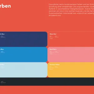
Overview of the color scheme for the calendar layout and the design elements, consisting of three shades of blue, pink, red, yellow and black
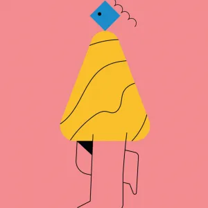
Character design of a person, made of geometric shapes, with line elements as legs and hair
Design element consisting of vertically stacked geometric shapes
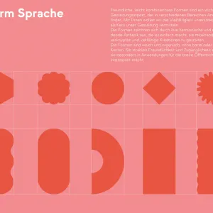
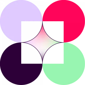
Overview of geometric design elements and their design language

Approach

The product we designed is a weekly calendar that deals with diversity in a museum environment. We started with friendly, light colors that are easy to combine due to their contrast. However, to draw attention to the relevance of this topic, red plays a special role in our product as a signal color.

The same approach that runs through the colors can also be found in the shapes. We have developed a modular system of harmonious and easily combinable shapes that enable a wide variety of creations in a simple and playful way. This approach helps us to make the topic interesting for the general audience and to ensure a very accessible entry point for everyone. In general, we have intentionally chosen design elements that do not represent specific characteristics in order to ensure diversity and give the viewer's imagination full rein.

Our calendar offers definitions, instructions, thought experiments, voices and examples on this topic. QR codes enable detailed information and personal research. The calendar promotes understanding for different perspectives, encourages self-reflection and collaboration. Although not everything about diversity can be learned after 52 weeks, the calendar is intended to provide an introduction and impart critical knowledge on this topic.

We have aroused your interest and you would also like to receive your own "Diversity Training" calendar? Then just write us hallo@zentralnorden.com and we will be happy to send one to you.

A stack of
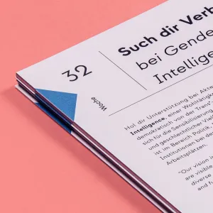
Details of lines and geometric elements that divide up the layout
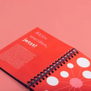
Double-page spread in red, with white text calling for
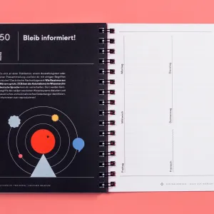
Double page of the calendar, the left page is designed with a text for information and an illustration, on the right page there are empty lines in the form of a weekly calendar
Colorful illustration of geometric shapes, from the