Interactive Dashboard for biometrio.earth for Data Analysis and Visualization

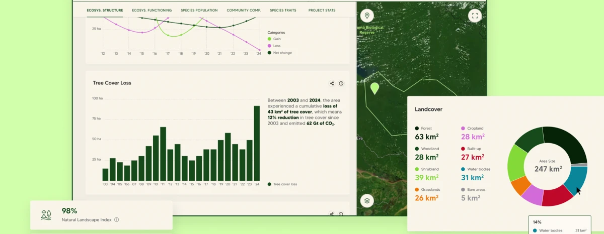
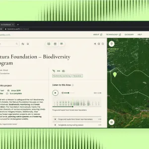
biometrio.earth's dashboard shows a screen with a map and diagrams that provide information about measurements in the selected area

Client

biometrio.earth

The start-up makes reliable statements about the biodiversity of areas. We have developed the nature analytics dashboard for them and their customers. It combines the data obtained and the concentrated scientific expertise in one overview. Biometrio.earth uses a holistic approach with a combination of remote sensing, on-site sensors and self-learning artificial intelligence. This holistic approach had to be clearly mapped in a dashboard.


Services
Concept
User Experience & User Interface Design
Prototyping
Design Systems
User Flows
Wireframing


Challenge

The main challenge in the design and conception of the dashboard was to structure the large amount of existing data and to organize which data is exciting and relevant for which stakeholder and where. With the help of wireframes and user flows, the data and functions were sorted and brought into a logical structure. Icons help to separate areas from each other, to lighten them up and to maintain an overview.

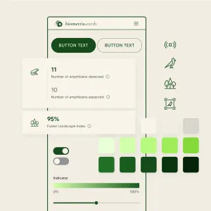
In addition, we had to expand the design system we had created and thus also the color scheme of biometrio.earth in order to be able to present scientific categories, diagrams and evaluations in a uniform way, for example. And very special for a dashboard: to ensure usability not only on the desktop, but also on mobile devices.
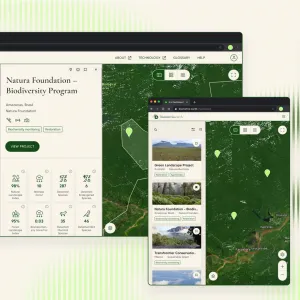
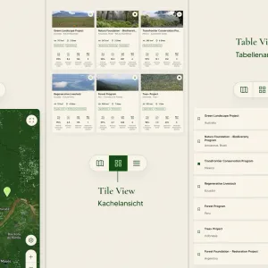
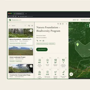
The map preview within the dashboard shows areas as tiles with photos on three different screen sizes, a laptop, tablet and smartphone screen.
With the map view, tile view and table view, users have three options for displaying the project preview.
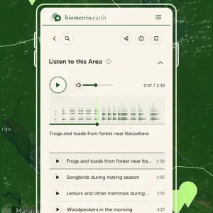
Within the projects it is possible to listen to various audio recordings from the respective area

Project Process

1. Requirements Analysis:
- Research on industry-specific dashboards
- Requirements specifications: Gathering functional and non-functional requirements
- Target and target group analysis: Identification and definition of target and purpose, as well as target groups and their needs

2. Data Sources and Modeling:
- Data structure and cleansing
- Cleansing and aggregation of data to the required granularity
- Development of user flows

3. UX & UI Design:
- Dashboard design as well as design of all elements such as icons and design of diagrams
- Definition of interfaces
- Implementation, testing and customization

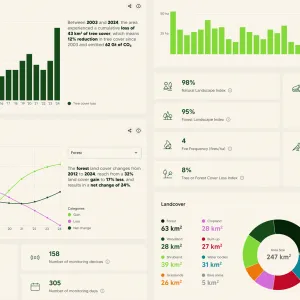
Different types of diagrams are used to visualize the collected project data. Bar charts, line charts, count charts and counters to highlight individual values.

Our Solution

The result is a dashboard that is not only fun to use but also offers real added value. Data on the biodiversity of locations from all over the world is bundled and clearly visualized in the analysis tool. Click here for the branding case and the website for biometrio.earth.

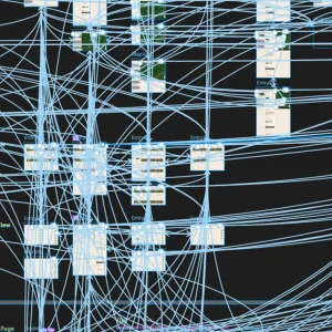
Countless lines show the interactions between the individual screens in the Figma program
The individual page of a project shows a location map and project-specific details, such as the categorization of the project type, a description text and image and audio data associated with the project.
The project preview shows an additional expanded information level with initial detailed information and data on the project area
The design of the dashboard consists of beige backgrounds and dark green text, in serif and sans serif fonts, combined with minimalist rounded line icons, rounded interface elements such as buttons and an extended color palette of light green hues.