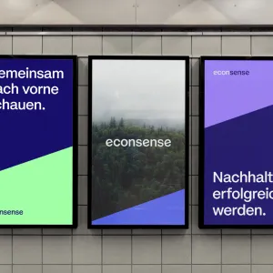
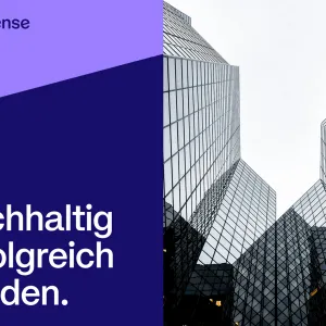
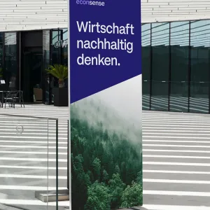
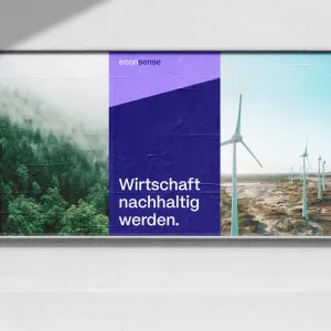
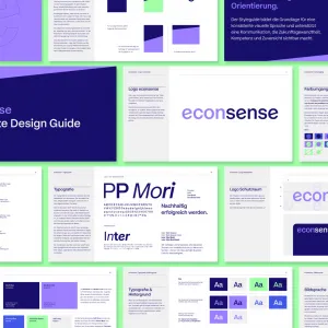
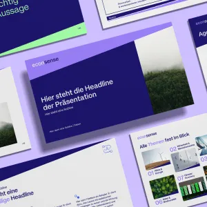
A strong voice for a sustainable economy – the new branding for econsense

Three illuminated posters in blue and green tones featuring a nature motif and the messages “Looking ahead together.” and “Achieving sustainable success.”

Client

econsense

econsense is the sustainability network of German business. Together with its member companies, the organization is driving the transition to a more sustainable economy.

As a platform for exchange, guidance, and inspiration, econsense brings leading companies together to develop solutions to key transformation challenges. In the future, this role as a catalyst should be more clearly reflected in its visual identity.


Services

  • Concept development
  • Branding


Challenge

The existing visual identity was functional but lacked impact.
Econsense’s role as a facilitator of key future-oriented topics and as the voice of the business community for sustainable transformation was not adequately conveyed visually. At the same time, there was a lack of clear design elements that would provide guidance and enhance brand recognition.

Three illuminated posters in blue and green tones featuring a nature motif and the messages “Looking ahead together.” and “Achieving sustainable success.”

Our Solution

In collaboration with econsense, we developed a corporate design that positions the organization as a strong advocate for sustainable transformation within the business community.
Distinctive typography, a striking color palette, and a flexible layout system create a clear, modern, and confident brand identity.

Key visual in econsense branding in blue and violet tones, with an architectural motif and the headline “Achieving sustainable success.”
Freestanding display in the econsense design in blue and green tones, with a nature motif and the claim “Rethinking the economy sustainably.”
Large-format billboard in the econsense design, using corporate colors, featuring the headlines “Looking ahead together.”, “Making the economy sustainable.”, and “Achieving great things together.”

Design decisions

As part of the design strategy, we first conducted a comprehensive design audit and analysis of the existing visual identity. Building on this, we developed key guiding principles—competence, confidence, and courage—and derived a clear design direction.

For the logo and typography, the wordmark was further refined based on the typeface PP Mori. A distinctive design feature is the characteristic slant in the “e,” which adds a unique sense of dynamism to the identity. This is complemented by a typographic system combining PP Mori and Inter.

The color palette was designed to be modern and accessible. Dark Blue serves as the base color, while Modern Lilac, Vibrant Blue, and Futuristic Green are used as accent colors.

The layout system is modular and designed to work across media. Clear axes, generous spacing, and a reduced visual language create clarity and balance. The slant acts as a central design element, visually conveying dynamism and progress.

Overview of the corporate design guide in blue, violet, and green tones, featuring the logo, color palette, typography, and the title “econsense Corporate Design Guide.”

The new corporate design reinforces econsense’s role as a leading voice in the business community advocating for sustainable transformation—and establishes a clear foundation for communication in the years ahead.

Presentation layouts in the econsense design in blue and violet tones, featuring modular content and sample text such as “This is where the presentation headline comes.”